3D PLM Enterprise Architecture

User Interface - Dialogs

Dialog Class Catalog

Illustrated catalog linked with programming information
Quick Reference

Dialog objects are , windows, menus, bars, boxes, items, indicators, and controls. They share the base class CATDialog. Two other objects are useful: the grid constraints and the interactive application.

Table 1: Windows
Contain all other objects
Window The window object base class to share window and dialog box behavior
CATDlgDocument.jpg (16087 bytes) Application Window Accommodates a SDI or MDI application.

The document window is the main application window. It can contain one or several dialog windows, each containing a document's presentation, depending on whether the application is SDI (Single Document Interface) or MDI (Multiple Document Interface), and other dialog windows. In addition, it usually features a menu bar, toolbars, and a status bar.

CATDlgDocument1.jpg (8924 bytes)
ListDialog.jpg (13352 bytes)
Dialog Window Accommodates any dialog.

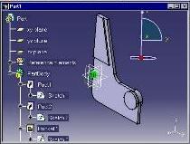
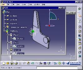
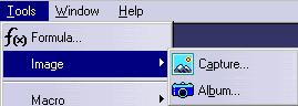
The dialog window is designed to enable the dialog between the end user and the application. It can contain a presentation of the application document such as an 2D or 3D viewer, or a 2D graph immersed into a 3D viewer as shown in the Part1 window. It can also contain controls, such as in the Macro window. The dialog window is designed to allow for data acquisition from the user. Applications can thus request data from the user to go on executing. In addition, a dialog window can be set to modal. In this case, the dialog is limited to this window, and when it ends, the window disappears.

ListNotify.jpg (7009 bytes) Message Window Displays help, error, and information messages.

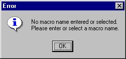
The message window is used for displaying information, warning and error messages to the end user. The application can also request a validation from the end user to go on working using a message window.

CATDlgFile.jpg (14683 bytes) File Window Enables file selection.

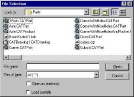
The file window offers a standard file selection box with a filter to apply to search for files. There are three kinds of file windows: default, apply, and help. Apply and help file windows feature an Apply and Help push button respectively, in addition to the OK, Filter and Cancel push buttons. In addition, a file window can be set to modal. The modal file window locks the dialog to this window as long as it is displayed.

[Top]


Table 2: Menus
Gather in a small area all the actions offered to the end user
Menu The menu object base class to gather in a small area the actions that are offered to the user. They are fully displayed on request only and save space for other purposes
ListMenubar.jpg (1871 bytes) Menu Bar Accommodates the menu bar of an application
CATDlgSubMenu.jpg (6585 bytes) Submenu Accommodates dropdown menus and submenus. (A submenu is also called a child menu with Windows.) The menus and submenus are used to group menu items for pull-down menus. Submenus are depicted using an horizontal arrow end and can be nested. Menu items trigger commands. Submenus items can be push items, radio items, check items, and separator items. In the figure beside, Tools is a menu. Among its items, some can be submenus. For example, Image is a submenu. Selecting Image displays the Capture, Album, and Video items.
ListContextualMenu.jpg (9158 bytes) Contextual Menu Accommodates an object's dependent menu.

Its contents depends on the context determined by the mouse position. (A contextual menu is also called a shortcut menu with Windows.) Usually, the mouse in a window can preactivate a given object by simply being located above it, and a floating menu depending on the preactivated object can be available using the mouse right button. The commands available in the contextual menu are dedicated to the object under the mouse.

A contextual menu, like any other menu, can contain submenus, push items, check items, radio items, and separator items. As an example, the figure beside shows the contextual menu of a PartBody. It contains push items, such as  Center Graph or Copy, separators, such as the one between Paste Special and Delete, and the PartBody object submenu.

[Top]


Table 3: Bars
Gather a set of controls and information without needing to arrange them
Bar The bar object base class to gather a set of controls without needing to arrange them. Controls appear in their instantiation order.
ListStatusbar.jpg (1677 bytes) Status Bar Displays temporary or permanent application's status information. It is generally located at the bottom of the window. It includes an area for messages in its left part, and can include push buttons, check buttons, radio buttons, and labels.
ListToolbar.jpg (2778 bytes) Toolbar Contains push buttons or other controls. Toolbars gather the tools of the application. These tools are commands represented usually using icons, and are also usually available from pull-down menus.

[Top]


Table 4: Boxes
Gather dialog components in consistent sets inside a dialog window or a toolbar
Box The box object base class to gather dialog components in consistent sets inside a dialog window. These components are usually controls, but a box can often contain boxes. For example, a frame can contain frames, as well as a tab page.
ListContainer.jpg (5648 bytes) Container Accommodates a scrollable area that can contain a single object. This object can in turn contain many objects.
ListFrame.jpg (12268 bytes) Frame Gathers controls having something in common.

The frame is designed to group several Dialog framework objects, like controls and labels, having something in common from the user or from the application point of view. In the figure beside, the second frame has a title.

ListIconBox.jpg (3037 bytes) Icon Box Makes a dropdown menu in a toolbar.

The icon box is used in a toolbar to build a pull-down (dropdown) menu composed of icons. Each of  these icons represents a command and can be clicked to fire an action. To open the icon box, the end user clicks the arrow. This displays the icons available in the icon box. The icon the user will click will remain the only one displayed afterwards.

ListSplitter.jpg (3606 bytes) Splitter Enables two resizeable subareas.
ListTabContainer.jpg (9112 bytes) Tab Container Gathers a set of tab pages presented as a tab index. Also known as a property sheet. It presents a tab index at the top to select the page to show. One page is shown at a time.
Tab Page Gathers controls having something in common. Also known as property page. Accessed form its tab index in a tab container. The tab page is one of the pages available in a tab container.

[Top]


Table 5: Items
Make up dropdown menu components
Item The menu item base class to share item behavior
ListPushItem2.jpg (1582 bytes) or ListPushItem1.jpg (963 bytes) Push Item Executes an action from a menu, submenu, or toolbar.
ListCheckItem.jpg (1360 bytes) Check Item Sets an option among several available options in a menu, submenu, or toolbar.
ListRadioItem.jpg (2002 bytes) Radio Item Sets an option among several mutually exclusive available options in a menu, submenu, or toolbar.
ListSeparatorItem.jpg (11800 bytes) Separator Item Separates controls in menus, submenus, and toolbars.

[Top]


Table 6: Indicators
Provide a visual help to the end user
ListLabel.jpg (990 bytes) Label Adds an information text to a control
ListProgressBar.jpg (1807 bytes) Progress indicator Displays the progress of a lengthy operation
ListSeparator.jpg (776 bytes) Separator Separates two subareas of a dialog or container

[Top]


Table 7: Controls
Execute actions, set options, or enter or select texts or values
Control The control base class to share unit and contextual menu management
ListCheckButton.jpg (1510 bytes) Check Button Sets an option among several available ones
ListCombo.jpg (1587 bytes) Combo Selects one alphanumerical value in a discrete list
ListEditor.jpg (1270 bytes) Editor Enables characters to be entered
ListMultilist.jpg (3022 bytes) Multilist Selects connected values within a set of finite lists
ListPushButton.jpg (1050 bytes) Push Button Executes an action
ListRadioButton.jpg (1312 bytes) Radio Button Sets an option among several mutually exclusive ones
ListScrollbar.jpg (1086 bytes) Scrollbar Scrolls a clipped object
ListSelectorlist.jpg (1496 bytes) Selector List Selects one or several alphanumerical value in a discrete list
ListSlider.jpg (1263 bytes) Slider Selects a numerical value among a discrete list by dragging along with the mouse.
ListSpinner.jpg (1469 bytes) Spinner Selects a numerical value among a discrete list by clicking up and down arrows

[Top]


History

Version: 1 [Jan 2000] Document created
[Top]

Copyright © 2000, Dassault Systèmes. All rights reserved.