3D PLM Enterprise Architecture |
User Interface - Dialogs |
Dialog OverviewA first glance at dialog windows and boxes |
| Technical Article | ||
AbstractThis article introduces the Dialog framework architecture and components. |
You will find below:
[Top]
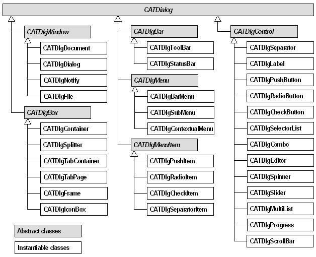
Below are the Dialog Framework classes used in dialog windows and arranged in a tree showing the inheritance links. In addition to these classes, the Dialog Framework includes the class CATInteractiveApplication [1] you will derive to create your own application class with dialog windows, and the notification classes which are used to propagate user interactions in dialog windows to the command that can deal with them.

[Top]
The Dialog framework includes two main class types:
All these classes derive from the abstract class CATDialog
which includes methods to define their common behavior and attributes. These
include:
[Top]
The containers are used to contain several dialog components and to handle them as a whole, for example for layout purposes. They can be classified in:
[Top]
The windows are the primary containers which contain either other containers and components. They can be moved and resized. They include:
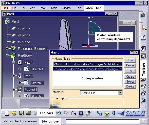
The document window is the main application window. It can contain one or several dialog windows, each containing a document's presentation, depending on whether the application is SDI (Single Document Interface) or MDI (Multiple Document Interface), and other dialog windows, such as the Macro window. In addition, it usually features a menu bar, toolbars, and a status bar.
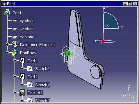 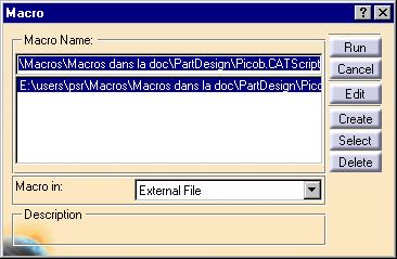 |
The dialog window is designed to enable the dialog between the end user and the application. It can contain a presentation of the application document such as an 2D or 3D viewer, or a 2D graph immersed into a 3D viewer as shown in the Part1 window. It can also contain controls, such as in the Macro window. The dialog window is designed to allow for data acquisition from the user. Applications can thus request data from the user to go on executing. In addition, a dialog window can be set to modal. In this case, the dialog is limited to this window, and when it ends, the window disappears. |
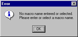 |
The message window is used for displaying information, warning and error messages to the end user. The application can also request a validation from the end user to go on working using a message window. |
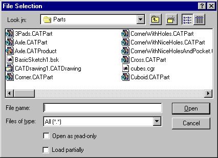 |
The file window offers a standard file selection box with a filter to apply to search for files. There are three kinds of file windows: default, apply, and help. Apply and help file windows feature an Apply and Help push button respectively, in addition to the OK, Filter and Cancel push buttons. In addition, a file window can be set to modal. The modal file window locks the dialog to this window as long as it is displayed. |
[Top]
The boxes are used to gather dialog components in consistent sets inside a dialog window. These components are usually controls, but a box can often contain boxes. For example, a frame can contain frames, as well as a tab page. The boxes' base class is CATDlgBox. They include:
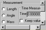 |
The container defines a scrollable area which can contain a single object, this object could be a frame itself containing as many objects as you want. If the container contents does not fit in the displayable area, horizontal and/or vertical scroll bars are automatically created to allow scrolling through this contents. The figure beside shows a container that contains the frame Measurement as unique child. This frame contains radio buttons, frames, and other controls that can be seen using the scroll bars. |
 |
The splitter consists in an area split into two resizeable subareas by a sash that can be dragged along to resize, decreasing one subarea while increasing the other. The split between the two subareas can be vertical or horizontal. The two splitters shown in the figure above contain both a label and a frame. |
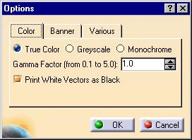 |
The tab container gathers a set of tab pages, instances of the
CATDlgTabPage class, one page being shown at a time. It presents a tab
index at the top to select the page to show. This is the Color tab
page in the fiugre beside.
The tab page: class CATDlgTabPage. The tab page is one of the pages available in a tab container. The Color tab page displayed beside contains several controls: three radio buttons on top, a label and a spinner below, and a check button at the bottom. |
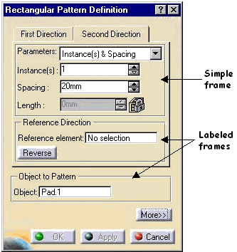 |
The frame is designed to group several Dialog framework objects, like controls and labels, having something in common from the user or from the application point of view. In this figure, the left frame is empty while the right frame contains three radio buttons, five check buttons, and a vertical slider. |
|
The icon box is used in a toolbar to build a pull-down (dropdown) menu composed of icons. Each of these icons represents a command and can be clicked to fire an action. The figure left shows an inactive icon box. It displays only the last icon selected and an arrow. The figure right displays the same icon box while the user is selecting another icon than the last selected one. To do this, the end user clicks the arrow. This displays the four icons are available in the icon box. The icon the user will click will remain the only one displayed afterwards. |
[Top]
The bars allow to gather a set of controls without needing to arrange them. Controls appear in their instantiation order. They include:

![]()
The tool bar is designed to gather the tools of application. These tools are commands represented usually using icons, and are also usually available from pull-down menus.
![]()
![]()
The status bar is used to display temporary or permanent information. It is generally located at the bottom of the window. It includes an area for messages in its left part, and can include push buttons, check buttons, radio buttons, and labels.
[Top]
The menus gather in a small area the actions that are offered to the user. They are fully displayed on request only and save space for other purposes. They include:
The menu bar is the object to house the main menus of an application and as such is the application entry point. Each main menu is composed of pull-down menus, each of them composed of items
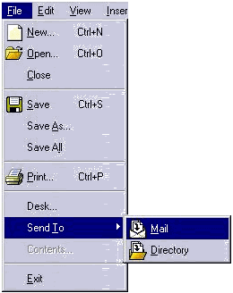 |
This class is used for menus and submenus. (A submenu is also called a child menu with Windows.) The menus and submenus are used to group menu items for pull-down menus. Submenus are depicted using an horizontal arrow end and can be nested. Menu items trigger commands. Submenus items can be push items, radio items, check items, and separator items. In the figure beside, File is a menu. Among its items, some can be submenus. For example, Send To is a submenu. Selecting Send To displays the Mail and Directory items. |
 |
The contextual menu depends on the context determined
by the mouse position. (A contextual menu is also called a shortcut
menu with Windows.) Usually, the mouse in a window can preactivate a
given object by simply being located above it, and a floating menu
depending on the preactivated object can be available using the mouse
right button. The commands available in the contextual menu are
dedicated to the object under the mouse.
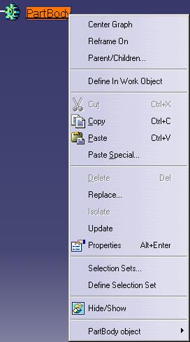
A contextual menu, like any other menu, can contain submenus, push items, check items, radio items, and separator items. As an example, the figure beside shows the contextual menu of a PartBody. It contains push items, such as Center Graph or Copy, separators, such as the one between Paste Special and Delete, and the PartBody object submenu. |
[Top]
The components are the dialog objects you will use to let the user interact with your application. When the user performs such interactions, you trigger methods to execute the requested action until it is completed. The callback mechanism allows you to link a component, usually a control, with such methods.
The controls can be classified into different functional groups:
They are described below.
[Top]
They are used to name some controls or containers and to help to layout windows. They include:

The separator is used to leave thin vertical or horizontal empty areas between different Dialog framework objects to help better visualize the different parts of a window or box.
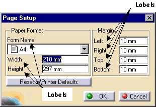 |
The label is used to add an information text to controls and to other objects as well, such as frames. This text can be parametrized with data coming from the application. |
CATDlgProgress 
The progress indicator gives feedback about a task completion rate.
[Top]
The push button: class CATDlgPushButton
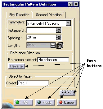 |
The push button is the only control dedicated to execute an action, such as trigger a command, display help, cancel or quit the window. Use the push button whenever you want to execute an action as soon as the user has pushed on the push button. |
[Top]
Two controls allow to set options:
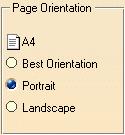 |
Each circle and its related title is a radio button instance. The
radio buttons allow for selecting mutually exclusive options, that is
one radio button is in the "on" state and all the others are
in the "off" state. For example, you must choose for your
car one, and only one, motor-fuel value among the three proposed. The
on state is depicted by the specific color and shading of the radio
button "Unleaded" in the picture. This can vary depending on
the platform.
Use radio buttons whenever you propose to the end user a choice among several exclusive options, that is when one option only can be selected. |
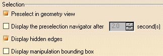 |
Each square and related title is a check button instance. The check
buttons allow for selecting several options among all the options
proposed, that is several can be in the "on" state while the
others are in the "off" state. The "on" state is
depicted by the specific color .
Use check buttons whenever you propose to the end user a choice among several inclusive options, that is when several options can be selected at the same time. |
[Top]
These controls allow to key in or to enter a text or a value, or to select a value from a proposed list.

The selector list allows to create a window on a list of values and to allow the end-user select one or several values in the list. The values are generally a character strings.
Use the selector list when you propose to the end user a choice among a list, or possibly several choices.
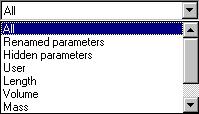
The combo allows to select a value or an option by selecting a character string from a predefined list, or through a keyboard entry.
On this picture, the three types of combos available are displayed from left to right:
Drop down and standard combos allow for keyboard text entry if required.
Use the combo whenever you want to select in a list and possibly key in a character string.
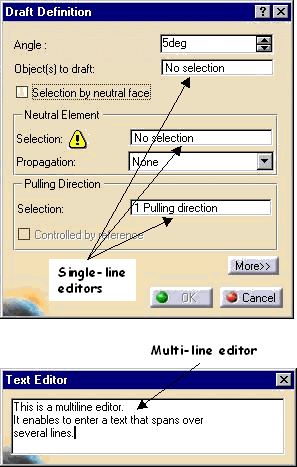 |
The editor allows character strings to be keyed in. Two kinds of editors exist: the single-line editor that accepts input on one line only, while the multi-line editor enables you to enter text spanning on several lines. Use the editor whenever you want the user to key in a character string without predefined values. |
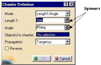 |
The spinner allows a value to be chosen and selected
among a discrete list. The value can be incremented or decremented by
clicking the arrows. It can also be entered.
Use the spinner when you ask the user to select a numeric value which ranges between two limits with a fixed step. You can also use the slider. |
 |
The slider allows a value to be selected among a
discrete list. The value can be incremented or decremented by dragging
along with the mouse. The step between each displayed value can be set
upon request. A slider can be vertical or horizontal.
Use the slider when you ask the user to select a numeric value which ranges between two limits with a fixed step. You can also use the spinner. |
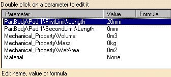 |
The multi-list allows connected values to be presented
and selected within a set of finite lists. Selecting a value in one
list selects all the connected values in the other lists, that is all
the values located on the same line.
Use the multi-list when you want the user to select among a finite list of predefined values which can feature several sub values. |
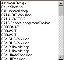 |
The scroll bar allows scrolling facilities to be set to
a scrollable dialog object, that is usually a container. Scroll bars
can be vertical or horizontal. The figure shows a selector list that
is too big to fit in its dedicated area. A vertical scroll bar allows
the end user to scroll and select into the list.
Use the scroll bar when you want to enable scrolling facilities in a container of your own that you do not want to display entirely. Note that a CATDlgContainer instance is created with scroll bars by default. |
[Top]
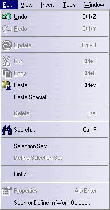 |
|
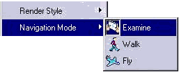 |
The radio item is used to build menus and submenus. A radio item has two states, on and off. One of the radio items can be in the state on while all others are in the state off. Selecting another radio item sets this radio item to on and sets back to off the radio item which was on. |
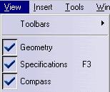 |
The check item is used to build menus and submenus. A check item has two states, on or off. Selecting a check item sets its state to on if it was off or to off if it was on, regardless the state of the other check items. So several check items can be in the state on while several others can be in the state off. |
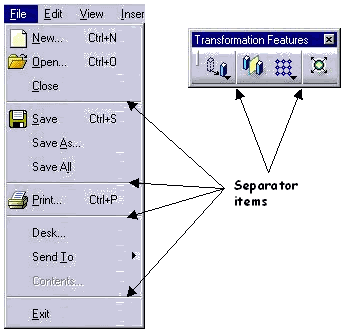 |
The separator item allows to group consistent menu items. The submenu beside features a separator item between Save and Print. The menu items New, Open and Save deal with creating, opening and saving files respectively, that is with a consistent set of file access functions. Print deals with printing the contents of a file and can be separated than the previous menu items. Additional menu items dealing with printing could be added below Print, and a new separator item could separate them from possible next menu items. |
[Top]
| [1] | Designing Your Interactive Application |
| [2] | Creating Dialog Objects |
| [3] | Assigning Resources to a Dialog Box |
| [4] | Arranging Dialog Objects |
| [Top] | |
[Top]
| Version: 1 [Jan 2000] | Document created |
| Version: 2 [Fev 2003] | Document updated |
| [Top] | |
Copyright © 2000, Dassault Systèmes. All rights reserved.