RADE |
C++ Interactive Dashboard |
Working with the RADE Dashboards - Part 3Dialog Builder features |
| Technical Article | ||
AbstractThis article describes how to use the dialog builder commands available in Visual Studio .Net. The Dialog Builder enables you to interactively design a dialog object layout and to hook callbacks on the generated events. To find out more, refer to the general documentation of the Code Generator, to the general principles for working in the Visual Studio .Net environment, and to an example of the first command to run [1].
|
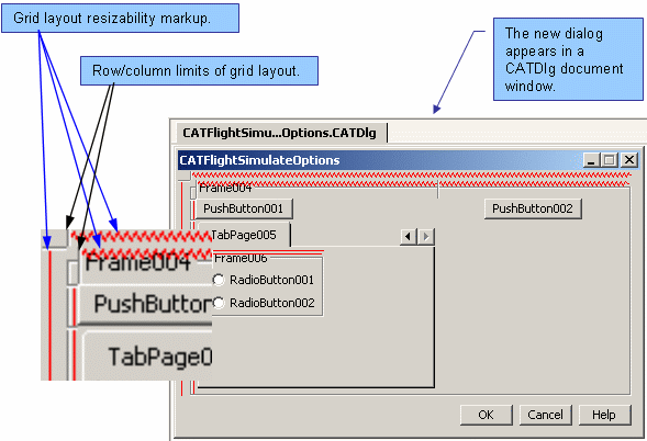
When you use the dialog builder, you see a layout that differs slightly from what will be your final run-time dialog. Note the following characteristics:
Unlike in programming mode, the interactive dialog builder only lets you create dialog elements with "Grid Layout". In Grid Layout mode, dialog containers contain virtual rows and columns and each widget is placed at a given row and column, eventually spanning several rows (columns). These rows and columns can be of fixed or variable size (in other words, they can be resizable or not). If resizable, they will stretch to fill as much of the area of the dialog box as possible. When the user resizes the dialog box, the width (or height) of the column (row) will be adjusted accordingly.
In the dialog builder, this information is visualized to help you understand how you are setting your layout. This is the grid layout markup. The area allocated for grid layout markup will not be present when the object is displayed during run-time execution. Each line corresponds to a row or column. For each container, a new grid is symbolized. Springy lines between two consecutive markups indicate that the grid row or column is resizable, and will stretch when the dialog is resized.
The grid layout can be rendered even more explicit by having the full grid be drawn. Even though this does not change the way the dialog builder behaves, it can make understand the positioning, resizing and anchoring of your widgets significantly easier. For example, if you use the Display Grid on the previous Dialog, you will get this result:
[Top]
You can create interactively a new dialog element based on the Dialog
framework by selecting the menu File
then Add CAAV5 Item/CATIA Resource/Dialog...
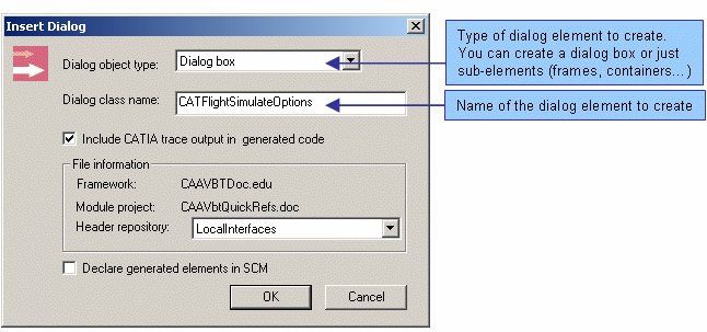
When you select this command, the dialog class wizard is displayed. The first thing to do when you create a new dialog is to define the dialog class that will store both your layout and callbacks. This is done by entering the following information in the dialog class wizard:
If you are not familiar with this presentation, refer to the Overview in the Code Generator documentation.
 |
If you wish to create a dialog-box based command, use
Command... found in the
CATIA Resource submenu of the
File menu. Refer to
Creating a new
command. |
When you click OK, the CAA V5
Generation dialog box gives you some information on the various elements that
will be generated by the CAA V5 wizard as well as the name of the workspace
where these elements will be stored.
After clicking OK to close the
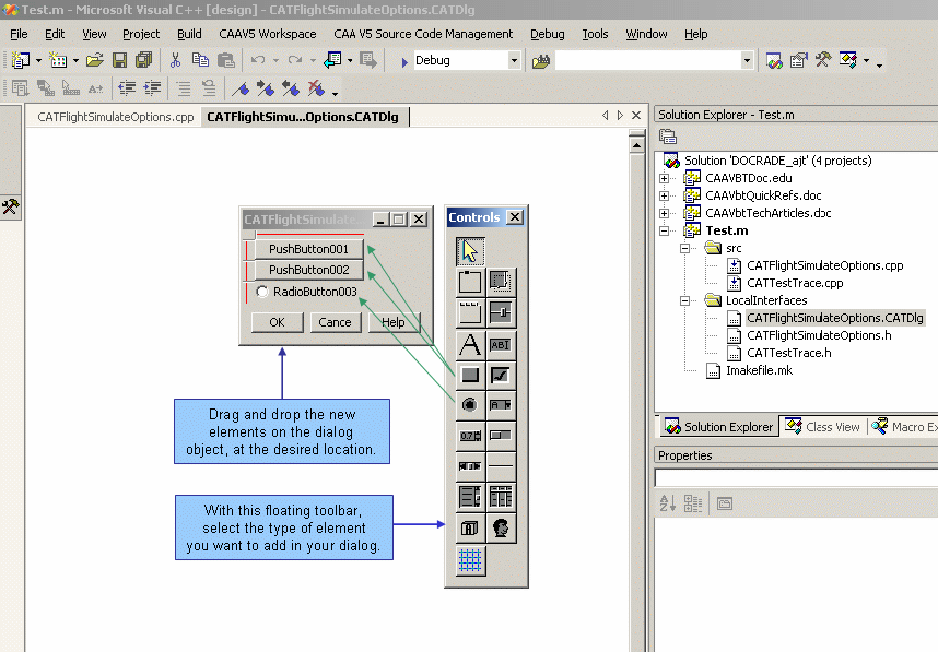
dialog box, a new page is initialized in Visual Studio .Net containing
an empty dialog element. A floating toolbar gives you access to the various
controls you may insert in the dialog:
When you design your dialog box, remember that the dialog object is based on a grid layout, so when you drop objects, they may not be located exactly where you placed them. The builder locates them in the closest grid available. If you drop on an empty grid in a container, it will be placed in the indicated grid position. If however a control element is already situated in that position then a new row or column will be inserted next to the element (on its left, right, top or bottom depending on where you clicked) and the new element will be inserted in the new row or column. Of course the overall shape and size of the dialog will probably be affected.
[Top]
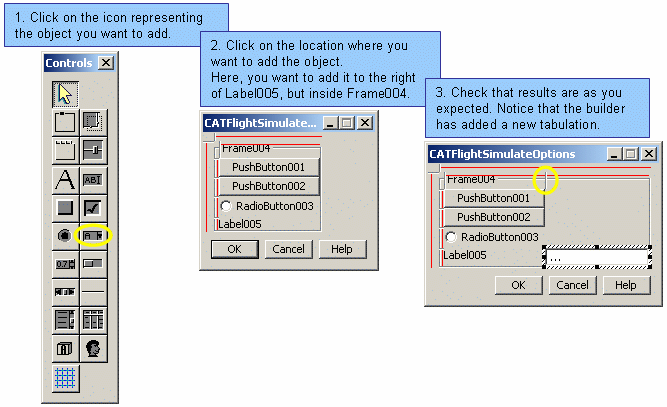
Note that you can simply drag the elements from the floating toolbar and drop them on the dialog under construction.
[Top]
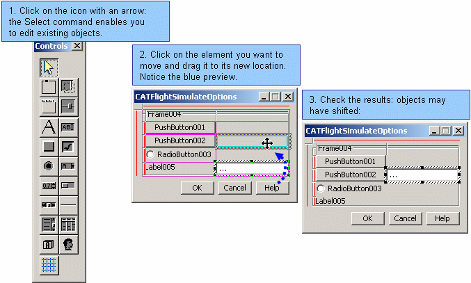
Moving dialog elements is done by dragging them from their initial position to their target location. While dragging, pay attention to the feedback that tells you where the object will be positioned.
[Top]
[Top]
[Top]
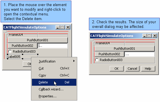
You may also select the element and hit the Delete key.
[Top]
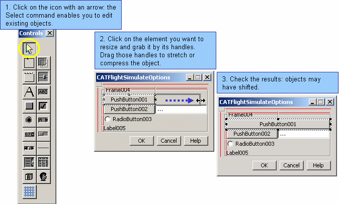
You select dialog elements by clicking them in the Select command. A selected element has a tracker frame drawn around it. Once an element is selected, you can use accelerators on it without using the mouse. Those accelerators are used for editing the object, deleting it or cut/copy and pasting it.
If an element is not easily grabbed by the mouse, you can use the arrow keys on your keyboard to switch between the currently selected object. The up and down arrows allow you to move up and down the container/containee hierarchy. The left and right arrows allow you to scan through the siblings of a container.
[Top]
[Top]
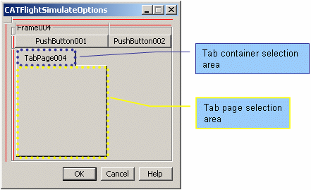
A tab page is a structure allowing you to superimpose several tab-pages accessible through tabs. When you create a tab container using the builder, you automatically get one tab page. The surface occupied on the screen is partitioned to allow you to select either the tab-page or the tab-container.
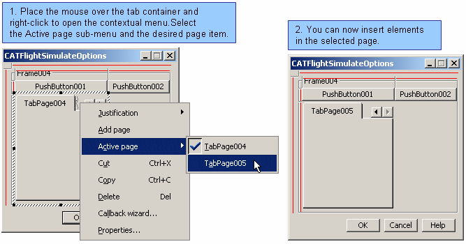
You create new tab pages using the contextual menu and you switch active tab pages using the contextual menu.
[Top]
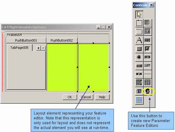
A parameter feature editor allows you to select and edit parameter features. These are particularly useful when creating interactive commands where parameter features are widely used.
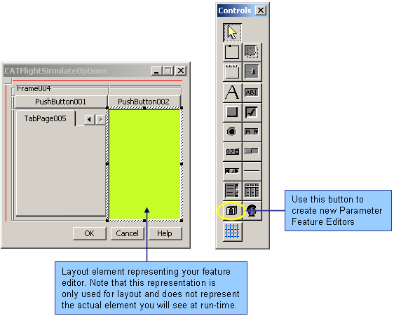
As for Custom Components, the code inserted in your C++ routine can be customized to suit your needs. By editing the properties of the parameter feature editor, you can modify the code that will be inserted in your routine. In most cases, you will only need to specify which parameter you wish to edit.
Within the code you specify in the Properties menu, you may use the following keywords:
Note that the wizard will not include the necessary "#include" C++ macros in your routine, and you may have to do it manually for your code to compile.
[Top]
A custom component can be any kind of dialog element you wish to insert in your user interface. The code that will be inserted in your C++ routine is completely modifiable, and can be accessed through the properties of the custom component. The actual object that will be instantiated in your dialog component depends on the code you insert in your routine. While in the dialog builder, your component is represented by a green frame, which is particularly useful if you wish to arrange the layout of this component with respect to the other dialog components, or the dialog box in general.
Within the code you specify in the properties menu, you may use the following keywords:
Note that the wizard will not include the necessary "#include" C++ macros in your routine, and you may have to do it manually for your code to compile.
[Top]
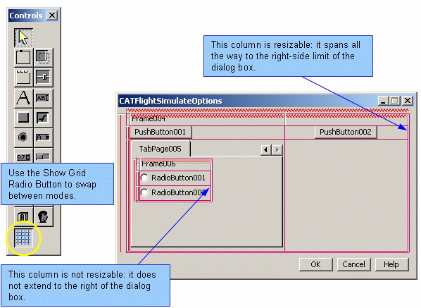
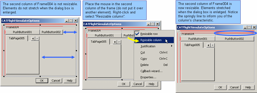
For resizable dialog boxes, you must determine how the various objects will stretch when the user resizes the dialog box. This is done by making your containers resizable or not. Your container has a grid layout and you can specify whether a column or a row is resizable. Notice that a squiggly line tells you when a row or a column is resizable. You can stretch your dialog box to see how the new property affects the elements. To stretch a dialog box, grab it by its border and extend it in the various directions.
For resizable dialog boxes, you must determine how the various objects will stretch when the user resizes the dialog box. For elements created by the dialog builder which possesses grid layout arrangement, this is done by making the columns and rows inside the dialog box resizable or not. When a dialog box is stretched or compressed, the amount of area gained or lost is spread out between the columns (respectively rows) that make up the dialog box. The contextual menu allows you to switch a column (row) between "resizable" and "non resizable" mode. Notice that a squiggly red line tells you when a column (row) is resizable. If no column (row) is resizable, the amount of area gained or lost is always attributed to the last column (row), but widget elements inside it are not affected by it (i.e. the column stretches, but not the widgets inside it). Note that this notion is recursive, and therefore containers included in the dialog box themselves have columns (rows) which may be set as resizable or not. To check the accomplished result, you can stretch your dialog box to see how the new property on the column (row) affects the various widgets contained therein. To stretch a dialog box, grab it by its border and extend it in the various directions.
|
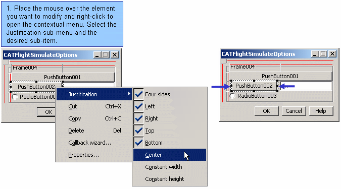
The capability of objects stretching is not only linked to resizing grids, but also to object justification. If an object is not right-attached, then it will not stretch with the grid box. |
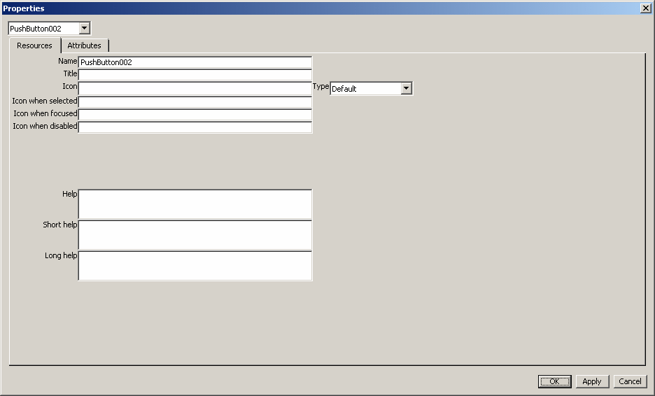
Modifying the properties is a very important step while designing a dialog object. With this, you cannot only modify the style of the object, but also the text that appears or the icons that you choose to display. The text that automatically appears in a push button is its name, which is not very informative. You can change the text by modifying its title in the Properties window. Changing the title rather than the name is preferable, because titles can be translated from one language to another. By modifying the style, you can modify many characteristics, such as screen appearance (eg. frame with a border box and/or a title), event generation (eg. repetitive event on a push button), modal behavior, etc...
To access the property page, place the cursor over the element you wish to
modify, right-click and select Properties...
in the contextual menu, or simply press "Enter" after selecting the object.
|
|
This attribute only makes sense in run-time context. And this editor presents the dialog box as if it were integrated in the users' application. So if the dialog box is created with the "modal" style, it will prevent users from editing it, and particularly from using drag&drop. So if you want to have a modal box in your application, design your dialog box, and keep in mind that the ultimate step you need to do is changing the style of your dialog box. |
[Top]
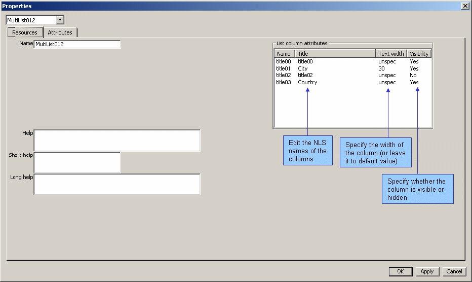
A multi-list is a list consisting of several columns. When you create a multi-list, you must set the number of columns you wish to create, their NLS names and their various properties. This is done by editing the properties of the multi-list.
By using the attributes tab, specify the number of columns of your multi-list.
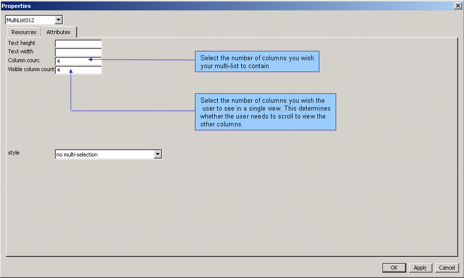
By using the resource tab, specify the NLS names of the columns, their widths, and whether they are hidden or shown.
[Top]
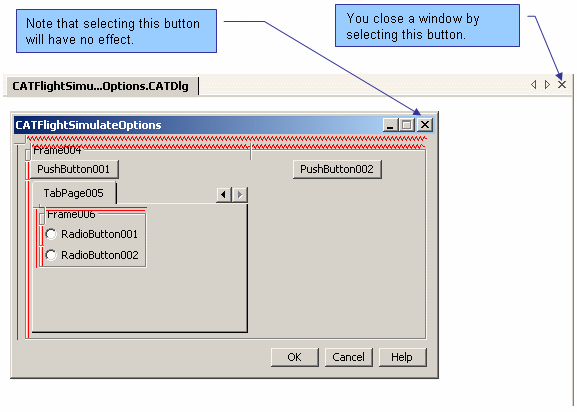
Closing a dialog session is done by closing the window containing the dialog
under construction. When doing so, you may be asked if you want to save the
last modifications you have made. Note that closing a window is done by using
the Close item in the
File menu, or by selecting the X button on
the CATDlg window as shown in the following image.
[Top]
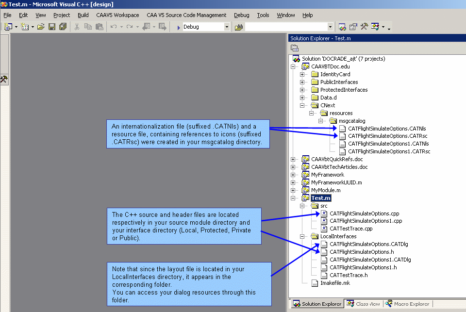
While interactively designing your dialog object, keep in mind that the only repository for storing your design is the generated source code. In other words, you always need to create a new C++ object to store both the layout design and the generated callbacks. Even though the dialog builder creates a special layout file (suffixed .CATDlg) to keep track of the various control elements in your dialog and their associated properties, this file is not used at Runtime. It may be a good idea however to save this file in case you want to modify your dialog layout at a later date. This file is stored in the LocalInterfaces directory of your module.
[Top]
Refer to the aforementioned Dialog Creation explanation. While you work with the dialog builder, every layout modification is done in memory and is not saved on file, nor is it reflected in your C++ code, until you ask for a file save. Since you can work simultaneously on the layout and the C++ code, it is important to keep in mind that until you do a file save, there may be discrepancies between the C++ source code and the actual layout you see in your window. When you close a dialog session, you will be prompted to save your work, if not already done.
[Top]
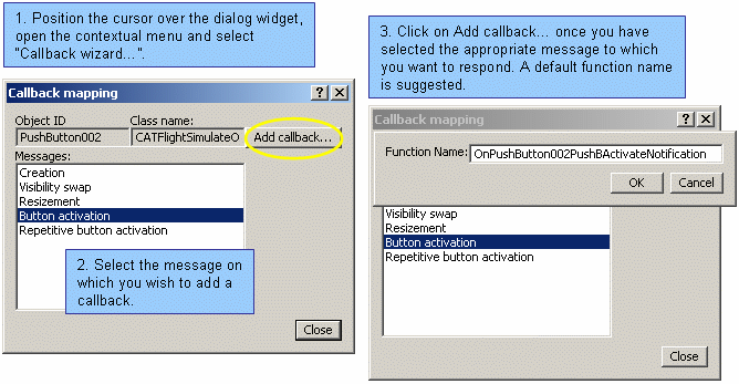
Once you have created a dialog C++ class to save your object, you may bind
member functions with events generated by your user interface. This is handled
by the notification mechanism. When you place your cursor over a dialog object,
you can right-click to open the contextual menu and select the item:
Callback wizard.... Then select the event
on which you want to bind a member function. A default name is suggested for
your function. You may modify it if you wish.
[Top]
Saving is done through the Save option of Visual Studio .Net or through the accelerator key Ctrl+S. Note that this accelerator only works if the MDI window has the focus (and not the Dialog window inside it that you are creating). Remember that when you save, you also modify your C++ code.
[Top]
Retrieving your dialog object is done by double-clicking the *.CATDlg file that stores your layout. This opens a CATDlg window showing your dialog window.
[Top]
| [1] | Code Generator Features |
| [2] | Customizing Microsoft Visual Studio .Net |
| [3] | Working with Microsoft Visual Studio .Net |
| [4] | Summary of Commands around mkmk |
| [5] | Workbench commands Mapping |
| [Top] | |
| Version: 2 [February 2005] | Document updated |
| Version: 1 [Jan 2000] | Document created |
| [Top] | |
Copyright © 2005, Dassault Systèmes. All rights reserved.