Rules and Standards
|
|
CAA V5 Ergonomics Rules - Part 1
Interface Components |
| Technical Article |
1. Interface Components Rules
1.1 Windows
1.2 Menus
1.3 Toolbars
1.4 Contextual Menus
1.5 Controls
1.6 Secondary Windows
1.7 Tree
1.8 Default Values and Customization
1.9 Manipulator Robot
1.10 Power Input
1.1 Windows
Windows provides the fundamental way in which a user views and interacts with
data. Consistency in window design is particularly important
because it enables users to easily transfer their learning skills and to
focus on completing their tasks rather than learning new conventions.
1.1.1 Application Window
Rule 1.1.1.1: The left side of a title bar
of an application window is composed of:
- The icon of the application and the application name if there is no
document window maximized.

- Or the icon of the application, the application name, a space plus a
minus sign plus a space, and the document name if the document window
is maximized.

|
| Rule 1.1.1.2: There is no menu bar. |
1.1.2 Document Windows
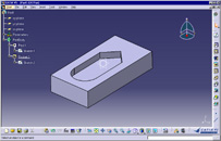
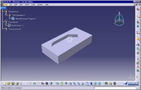
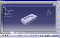
| Rule 1.1.2.1: At the creation of a new
document, one and only one new window appears: the window of the document.
This window take its characteristic (size, maximized or not, etc...) from
the previous active window, becomes the active window but not
change the characteristics of other windows. |
Example
|
Correct |
Incorrect |
 |
-> |
 |
|
Workbench transition OK |
The new document window (the tree and the workbench is
different) is over the previous window. |
 |
-> |
 |
|
Workbench transition KO |
The size of the original window was restored (not maximized).
Two new windows were created at the same time.
One of them was created minimized. |
Rule 1.1.2.2: The title bar of the
document (visible when the document window is not maximized) is composed
of:
- <document icon> <document name>
when we edit directly the document [Ex.1]
- <document icon> <edited object
name> in <document name>
when the edited object is imbedded in another document.
|
Example
Ex.1:Example of the title bar of a CATProcess Document.
| Correct |
Incorrect |

The title of the document window identify describes its content.
(Here the name Process1 is the default name of the new document.
At the save, the proposed name will be Process1.CATProcess) |

The title of the document window describes the nature of the
window. |
| Rule 1.1.2.4: The main window contains a
maximum of 4 zones. |
| Rule 1.1.2.5: The main window contains a
maximum of 3 zones. |
| Rule 1.1.2.6: The main window sizes as
large as possible to show the maximum of information to the user. |
| Rule 1.1.2.7: Scroll bars are always
visible when the application appears. |
1.2 Menus
Menus display a list of commands available to the user. Because menus makes
commands visible and discoverable, you can use them to leverage
the greater capacity people have for recognizing commands.
1.2.1 Menu Bar
Rule 1.2.1.1: All menu bar contains the
following titles of menu:
- Start (Does Not Apply To: JavaTop)
- File
- Edit
- View
- Insert
- (Format) [1]
- Tools
- Window (Does Not Apply To: JavaTop)
- Help.
|
| Rule 1.2.1.2: The specific menus of a
workbench are inserted between the "Tools" and
"Window" menus. |
Remark
[1] Format is not compulsory. Notation in all rules: Parenthesis in a
description is used for optional items.
See also
Mnemonics Presence
1.2.2 Start Menu
| Rule 1.2.2.1: The name of workbenches are
displayed in English, whatever language used (ex: "Assembly
Design" in French). However, the name of solution is translated (ex:
"Conception mécanique" in French) |
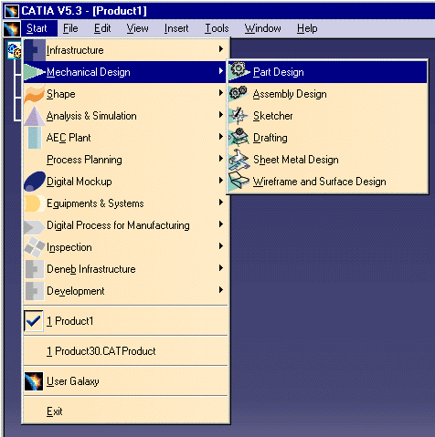
Rule 1.2.2.2: The start menu is composed
of 6 zones:
- The list of favorite workbenches
- The list of solutions
- The list of Windows
- The list of last documents
- User Galaxy
- Exit
|
Example of a start menu (here witout any favorite workbenches
defined)
 |
| Rule 1.2.2.3: The workbench item is
displayed in the sub-menu of its own solution. |
Example
Part Design Workbench is in "Mechanical Design" the sub-menu.
1.2.3 File Menu
Rule 1.2.3.1: The file menu contains only
commands about:
- the current document seen globally
- all the documents
- the exit of the application
|
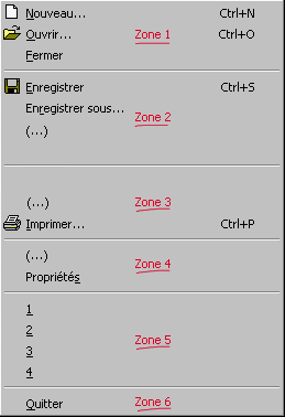
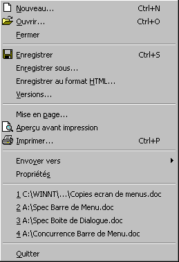
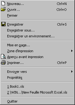
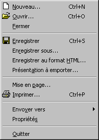
Rule 1.2.3.2: the File menu has 6 zones.
Zone 1: Open and Close (Optional For: JavaTop)
Zone 2: Save
Zone 3: Print
Zone 4: Other operations on the document (Optional For: JavaTop)
Zone 5: List of last used documents (Optional For: JavaTop)
Zone 6: Exit
containing the following items [1]:
|
Remarks
[1] Respect the order of compulsory items.Other items can be inserted where
(...) are displayed. They must be compatible with the description of the zone
and the menu.
Zone 1: Commands of opening and closure
- This zone contains items New…, Open… and Close. Not
modifiable
Zone 2: Commands of saving
- The two first articles are Save and Save as…
- Other items of save follows.
Zone 3: Commands of printing
- The first article (if exists) is Page setup...
- The two last items are Print preview... (if exists) et Print.
- Other item must be inserted between Page setup... et Print
preview impression.
Zone 4: Other operations on the document
- The articles of this zone are various operations on the current document.
Non modifiable zone.
- The submenu Send to… duplicates the document. The first zone of
this submenu list receivers that use those documents as they are. The second
zone groups receivers that transform the document when they import it.
- The item Properties (that is the only articles that does not
respect the suspension point rule) gives access to the properties of the
current document.
- the properties of the document does not impact the representation, the
nature of objets included in the document. The properties concerns the
document itself, his characteristics seen from the outside.
Zone 5: List of last used documents
- This zone contains the last 4 (configurable in Windows settings) documents
red.
- Access keys are 1, 2, 3 et 4, etc…
Zone 6: Exit
- This zone contains only Exit.
Examples
Ex 1: Word file menu
Ex 2: Excel file menu
Ex 3: PowerPoint file menu
1.2.4 Edit Menu
Rule 1.2.4.1: The Edit menu contains only:
- the current operation
- the clipboard
- selected object(s)
|
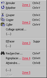
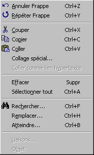
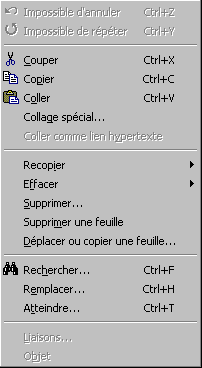
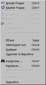
Rule 1.2.4.2: The Edit menu contains 5
zones [2]
Zone 1: Undo and Redo
Zone 2: Cut and Paste
Zone 3: Delete
Zone 4: Search and Select
Zone 5: Misc.
These zone must contains [1]:
 |
| Rule 1.2.4.3: The label
of Undo and Redo items contains the name of the concerned action. If
operations are impossible, labels are "Can't Undo" "Can't
Redo". |
Remarks
[1] Except "Find+Replace+Atteindre" that can be replaced by
equivalent commands.
[2] These zones contains:
Zone 1: Undo and Redo
- Contains only Undo+ <action name> et Redo <action
name>.
Zone 2: Cut and Paste
- the first tree articles are Cut , Copy et Paste.
- Next commands concern special pastes.
Zone 3: Delete
- First item is Delete. It deletes the selected elements.
- Second item (if exists) is Suppress. It suppress
the container of what is selected. This command has more impact that the
previous one.
- After these two "general" case, the article "Select
all" (if exist).
- Finally special case of delete or duplication generating a deletion.
Zone 4: Search and Select
- The typical items are Find… Replace… et Atteindre…
- Follows other article of search or replace them.
Zone 5: Misc.
- First item is Links… (if exists)
- Second item is Update… (if exists)
- Properties is just before Object
- The last item allows the edition of the object. Le label changes with the
selection. When the object cannot be edited, the label is "Object"
grayed.
Examples
Ex1: Word.Edit Menu
Ex2: Excel.Edit Menu
Ex3: PowerPoint.Edit Menu
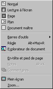
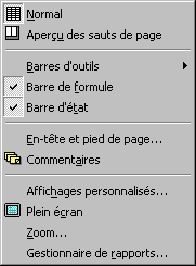
1.2.5 View Menu
Rule 1.2.5.1: The View menu contains only
commands about one of the following subjects:
- Style of display of the active document
- Filters on display of objects of the document
- Viewpoint
|
Rule 1.2.5.2: The View menu contains 5
zones: [1]
Zone 1: Choices of style of display of the active document
Zone 2: Displays of active document objects
Zone 3: Toolbars and active window contents
Zone 4: Display of auxiliary data of the document
Zone 5: Viewpoint
containing the following items:
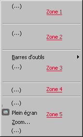
|
Remarks
[1] Respect the order of compulsory items.Other items can be inserted where
the sign (...) is displayed and must be compatible with the description of the
zone and the menu.
Zone 1: Choices of style of display of the active document
- This zone contains the different choice of representation of the whole
document of the active window.
Zone 2: Displays of active document objects
- This zone controls the various types of display of the document, i.e. how
objects are seen. This zone is optional. It depends on the possibility of
the document to modify its own representations (ex: PowerPoint Display in
black and white )
- This zone can include articles that create a new secondary window but this
window must deal with display of the document (ex: PowerPoint: Display of
the miniature slide).
- Items, if exist, can be ordered as follow:
- Choice of filters on document, Rendering Style, Perspective, Hide/Show
Zone 3: Toolbars and active window contents
All items display and hide tools around the active window or on the frame without
modifying the objects of the document.
- First item is Toolbar.
- Other items activate of hide tools which make up the active window.(
Arrange these items in a appearance order: left to right then up to down)
- Ex: Rule, Formula bar, Document explorer, Markers, Status bar.
- The last articles show and hide the tools presented as objects in the
scene.
Zone 4: Display of auxiliary data of the document
- Display first items about data linked to the document (usually they are
included only once in the document (ex: Header & Footer)
- Then other items about data linked to objects (ex: Notes,
Comments )
This zone drives the display of auxiliary data linked or imbedded in the
document. Items can:
- Make a modification of the configuration of the active window to display
data that cannot be inserted in the document window.
- Activate a move of the document toward the auxiliary data included in the
document but out of the window.
Zone 5: Viewpoint
This zone contains at least Full Screen and Zoom item. Items follow this
order:
- First items about defined views.
- Full screen display the active window in the whole screen. A non
modal window appears at the lower left corner of the screen to Close the
full screen.
- Zoom… changes to current zoom. (It can be a menu containing
several zoom actions)
- Then the Viewpoint submenu definition actions (except zoom
actions)
- The Navigation mode submenu
- Other commands on viewpoint
Examples
Ex1: Word View Menu (Note the absence of the zone 2 )
Ex2: Excel View Menu (Note the absence of the zone 2 )
Ex3: PowerPoint View Menu
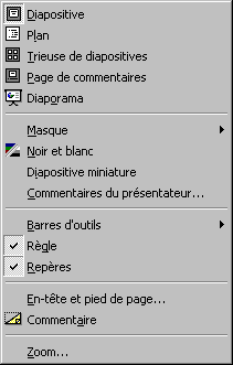 and
and 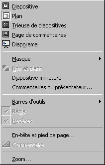
1.2.6 Insert Menu
| Rule 1.2.6.1: The Insert menu contains
only commands creating new objects or inserting existing objects inside
the active document. |
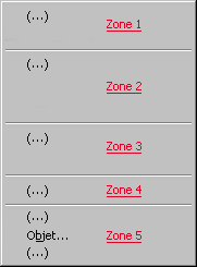
Rule 1.2.6.2: The Insert menu contains 5
zones: [1]
Zone 1: Objects structuring the document
Zone 2: Simple objects
Zone 3: Complex objects
Zone 4: Other objects
Zone 5: Import or insertion of existing objects or link allowing their
access
These zones must contains:
|
Remarks:
[1]: These zones contains:
Zone 1: Insert of objects structuring the document
- This zone is optional. It exists if the document is structured in objets
clearly identifiable. This zone gives access to their insert.
Zone 2: Insert of simple objects
- This zone contains most used articles.
- The order can be the decreasing importance of the insert effect or insert
application field.
- If exist, last article is Comment
Zone 3: Insert of complex objects
- This zone is optional. It contains objects more complex or more voluminous
objets than the previous zone.
Zone 4: Insert of other objects
Zone 5: Import of existing objects
- First, objets needing to define a zone to insert them
- Then import of objects used often.
- Finally 3 following articles: File…, Object (for
import of all objects) et Hyperlink….
Examples:
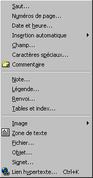
Word Insert Menu (Zones 2, 3, and 5)
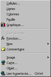
Excel Insert Menu (Zones 1, 2, and 5)
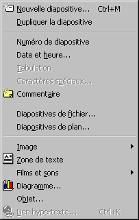
PowerPoint Insert Menu (Zones 1, 2, 3, and 5)
1.2.7 Tools Menu
| Rule 1.2.7.1: The Tools menu contains only
commands that act regardless of selected objects and that not create
elements in active document |
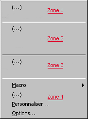
Rule 1.2.7.2: The Tools menu contains 4
zones [1]
Zone 1: Assistance
Zone 2: Version et Protection
Zone 3: Other tools
Zone 4: Personal configuration (macros, options)
These zones must contains:
 |
Remarks
[1]: Zones content:
Zone 1: Assistance tools depending of the document type
- First, articles about data validation,
- Verification,
- Configuration of the reference environment
- Library access
Zone 2: Versioning and Protection
- This zone is optional.
- First articles are about versioning and split (Sharing, Follow of
modification, Fusion)
- Last articles are about protection.
Zone 3: Divers
- This zone contains the tools specific to the application.
Zone 4: Personal configuration (macros, options)
- The first article is Macro giving access to execution,
creation and modification of macros.
- The second article is about complementary data for tools ("Macros complémentaires…"
or "Modèles et compléments…"
- The third article is Customize…
- The last article is Options….
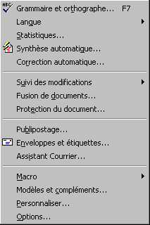
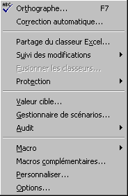
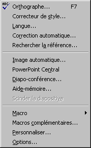
Examples:
Word Tool Menu:
Excel Tool Menu:
PowerPoint Tool Menu:
1.2.8 Menu Items
| Rule 1.2.8.1: Le label of a menu item ends
with suspension points when the users interactions are needed between the
begin and the end of the command. [1]

|
| Rule 1.2.8.2: A label followed by a right
arrows indicates a sub-menu. There is no icons for a sub-menu article.

|
| Rule 1.2.8.3: If an icon exists at the
left of the label, it must be pushed when the command is on [2]. If the
icon does not exists, there is a check item only if the item represents a
state (activated)
 inactive command or state with icon
 active command or state with icon
 active and inactive state without icons
|
Remarks
[1] So, if the command is executed and ends immediately, there is no
suspension points.
[2] If the window of the current command is modal, then it is impossible for
the user to access to menus. In this case, the rule has no meaning.
See also
4.2 User Interface Text Terminology
1.3 Toolbars
Toolbars and status bars are special interface constructs, like menu bars,
for managing a set of controls. They are designed to provide quick
access to specific commands and options.
1.3.1 Toolbars Display
| Rule 1.3.1.1: With a 1280x1024 pixels
screen and normal sized icons configuration, every visible toolbar [1] is
entirely visible. |
[1] Before any user customization.
Rule 1.3.1.2: Toolbars are displayed along
2 or 3 sides of the application window:
- the bottom border of the application window
- the right border
- the top border only if necessary.
|
Rule 1.3.1.3: Toolbars are displayed along
2 or 3 sides of the application window:
- the top border
- the right border
- the bottom border only if necessary.
|
Rule 1.3.1.4: Every toolbar is an ordered
list [1] of articles that can take 3 different layout:
- horizontal bar [Ex1]
- vertical bar. [Ex2]
- detached palette. [Ex3] [Ex4]
|
Remark
[1] It is a list and not an array. All articles are one after the other. It
is impossible to display one article on the top of another if the toolbar is
horizontal. All elements are ordered towards one direction ... otherwise it is a
dialog box.
Examples
Ex1: horizontal toolbar

Ex2: vertical toolbar
Note that the item zoom is not displayed. A textfield disappears or is
replaced by an icon of a command that display a dialog box including the
textfield.

Ex3: Most large Horizontal detached toolbar

Ex4: Most high vertical detached toolbar
Note that the width of the palette is given by the largest item (here the zoom
textfield with pulldown list).

| Rule 1.3.1.5: If the Up side toolbar
exists, it contains only attributes. |
| Rule 1.3.1.6: Toolbars appears only on one
row or column in authorized sides. |
Example
| Correct |
Incorrect |
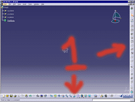 Only
one column on authorized sides. Only
one column on authorized sides. |
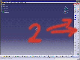
Two column of toolbars on the right side. |
1.3.2 Toolbar Controls
Rule 1.3.2.1: Every toolbar contains
exclusively:
- icons [1]
- icons menu,
- separators,
- textfield with list (combo) [2]
- menu titles.
|
Corollary: A toolbar does not contains labels [Ex.1]
Remarks:
[1]: Icons in toolbars are used for command buttons, check boxes or radio
button.
[2]: For editable textfield, the drop-down list is used to display the
previous values input. This list is mandatory because of the important use of
the field (otherwise this field will not be displayed in a toolbar by only in a
dialog box).
Example:
Ex.1: Example of labels in toolbars
| Not to do: A
toolbar with labels |
 |
| To do: No labels, information
are in tooltips |
 |
Rule 1.3.2.2: There is a maximum of 5
icons by zone [1].
 |
| Rule 1.3.2.3: The average number of icons
by zone in a toolbar must be between 2 and 4. [2] |
Rule 1.3.2.4: There is no separator
directly at the border of the toolbar.
|
No |
Yes |
|

|

|
|
Remarks
[1] Definition: In a toolbar, a zone is the space delimited by separators and
borders of the toolbar.
[2] In the example above, there is 19 icons for 6 zones (average of 19/6 =
3.16 icons by zone).
1.3.3 Status Bar
| Rule 1.3.3: A status bar is displayed at
the bottom of the application window. It contains at least a message zone
describing the state of the dialog. |
1.3.5 Tooltips
| Rule 1.3.5.1: Every item of a toolbar have
an tooltip. |
Rule 1.3.5.2: Except textfield when they
have the keyboard focus[Ex2], a tooltif appears when the cursor pass over
the item [Ex1]:
- after a moment if the tooltip of the next item was not already
displayed
- immediately if the tooltip of the next item was already displayed.
|
Examples
[Ex1]: Example of tooltip:

[Ex2]: Excepted when the textfield item has been selected (a) or during
edition (b)
(a)  (b)
(b)
Rule 1.3.5.3: The text displayed in a
tooltip is:
- the name of the created object when the commands insert an objet in
the document.
- or the name corresponding of the active value (when the button is
pressed) of a state, status, attribute, functioning [1]
- the name of the action when the command is an action.
- the nave of the value represented in a textfield.
|
Remark
[1]: The contains of a tool tip describes the nature of the
mode but not the purpose , neither its use.
For example, the tooltip of the button "Bold" is just called
"Bold" but not "Creation a bold new text or modification of the
bold of a text".
Example
| Correct |
Incorrect |

Only The name of the object created. |

The "New" word.
The lower case "p" instead of a "P". |
1.3.6 Standard Toolbars
Rule 1.3.6.1: The following standard
commands must be accessible through the toolbars as an icon:
| New |
Open |
Save |
Bookmark |
Cut |
Copy |
Paste |
Refresh |
Properties |
Change
Status |
Lock / Unlock |
Print |
Settings |
Help |
Close |
 |
 |
 |
 |
 |
 |
 |
 |
 |
 |
 |
 |
 |
 |
 |
 |
 |
 |
 |
 |
 |
 |
 |
 |
 |
 |
 |
 |
 |
 |
| Legend |
|
| |
command is specific to object selected |
| |
command applies to application |
|
Rule 1.3.6.2: The following commands are
accessible through visible toolbars:
- New, Open, Save, Print
- Cut, Copy, Paste, Undo, Redo, What's this
- The current workbench icon
- Select
|
| Rule 1.3.6.3: No command corresponding to
the following capabilities in the specific workbench toolbars (right
side):
|
Rule 1.3.6.4: The following toolbars are
located at a specific location:
- "Standard" toolbar is the first toolbar on the bottom side
- "Workbench" toolbar is the first toolbar on the right side
- "Select" toolbar is the second toolbar on the right side.
|
Rule 1.3.6.5: the command "New"
is only used for root object.
Other sub-objects should have commands which only have the entity name and
then based on the object either the create form or the insert form is
shown. |
1.4 Contextual Menus
Contextual menus, also called shortcut menus, provide an efficient
way for the user to access the specific operations of objects
or its immediate context. Because contextual menus are displayed at the
pointer's current location, they eliminate the need for the user to move the
pointer to the menu bar or a toolbar
1.4.1 Contextual Menu Contents
Rule 1.4.1.1: A contextual menu contains
articles giving access to the most used commands:
- that use the selected objects or act on in.
- that use the container of selected objects or act on in.
|
Remark
Contextual menus does not contains commands that do not care about current
selection.
| Rule 1.4.1.2: The maximum number or
articles in a contextual menu is 15. They are dispatched in 5 zones of 5
articles maximum each. |
| Rule 1.4.1.3: The number of levels of
submenus in a contextual menu is limited to 1. |
| Rule 1.4.1.4: The contextual menu is
not the unique access to a command ; the command must be also
accessible through the menus of the menu bar or toolbars icons. |
1.4.2 Contextual Menu for Objects
|
Rule 1.4.2.1: Every selectable object of
the document has a contextual menu.
For this rule, we only test if there is a contextual menu for each
selectable object.
We don't want to know if it's a specific one or not (for this level of
rule). |
| Rule 1.4.2.2: The background of a document
and unselectable objects have a common contextual menu. |
|
Rule 1.4.2.3: The structure of the
contextual menu of an object of the document is composed
of 6 zones:
- Assistance tools for selection
- Cut Copy Paste
- Particular commands of the object
- Commands of a more general semantic level
- Commands of the container using the object
- Properties [1]
|
Remark
[1] Instead of having an unique item "Properties", it is possible
to split the properties access in several items. For example, the contextual
menu of a text contains articles: Font, Paragraph, Bullets and Numbering.
Examples
Ex 1: Contextual menu of a cell of an Excel array. (zones 2, 3, 5, 6)
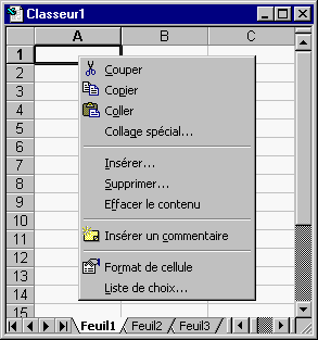
Ex 2: Contextual menu of a column (zones 2, 3, 6)
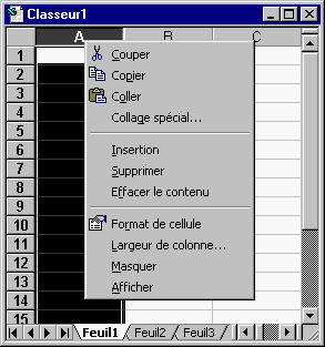
Ex 3: Contextual menu of a line
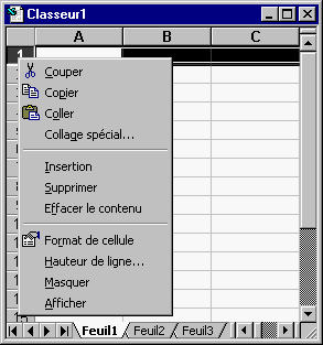
Rule 1.4.2.4: The contextual menu of an
object contains at least:
Cut,Copy,Paste, Properties |
Rule 1.4.2.5: The contextual menu of an
object contains at least:
Open In New
Open In Existing
Cut
Copy
Paste
Delete
Bookmark
Change Status
Properties |
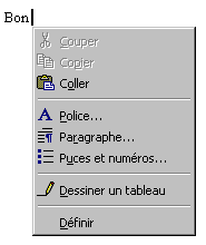
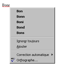
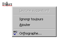
1.4.3 Contextual Menu for Error
Rule 1.4.3: The contextual menu of an
object with error display the contextual menu relative to the error. It
contains 3 zones:
- The possible solutions
- The commands to avoid the error
- The access to tools of resolution
|
Examples
|
Word without error |
Word with error and solution |
Word with error but without solution |
 |
 |
 |
1.4.4 Contextual Menu for Toolbars
Rule 1.4.4.1: The contextual menu of
toolbars and menu bar calls an unique and same menu make up of 2 zones:
- The 2 or 3 main toolbars followed by the list of all other toolbars
- The zone containing "Customize..." item.
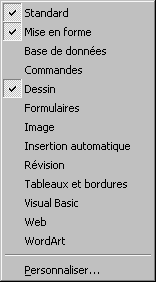
|
Rule 1.4.4.2: The status bar does not have
contextual menu for itself [2] But each items included in it has one.

|
Remarks:
[1] Although the menu bar calls the toolbar contextual menu, the list of
items of contextual menu does not contains the item "Menus" because
the menu bar cannot be hidden.
[2]: It is possible to allow to hide the status bar. In this case, the item
is only in View menu.
1.4.5 Contextual Menu for Dialog Boxes
Rule 1.4.5.1: The contextual menu of the
dialog box is called on the title bar of the dialog box. It contains
operations about geometry of the window.
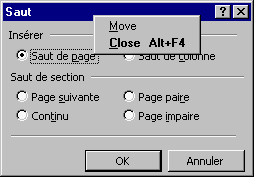
|
Rule 1.4.5.2: Each article of a dialog box
has a contextual menu. It contains at least the article "What's
this ?" that gives access to the contextual help about this
article.

|
1.4.6 Contextual Menu for Windows
| Rule 1.4.6.1: The contextual menu of the
application window is called through the title bar of the application. It
contains the window commands: Restore, Move, Size, Minimize, Maximize and
Close.
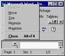
|
Rule 1.4.6.2: The contextual menu of a
document window is called through the title bar of the document window
[1], it is composed of the following zones:
- Operations on the document
- Windowing operations
- Specific tools (optional)
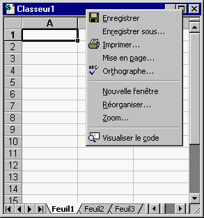
|
[1]: If the window is maximized, this contextual menu is not accessible
1.5 Controls
Controls are graphic objects that represent the properties or operations of
other objects. Some controls display and allow editing of particular values.
Other controls start associated commands. Controls are displayed in menus,
toolbars, contextual menus and secondary windows such as dialog boxes and
message boxes.
1.5.1 Control Labels
Rule 1.5.1.1: All items of a dialog box
have a label:
- Separators defines a zone; The label of a separator define the name
of the zone.
- Every check box is followed by a label.
- Every set of radio buttons is preceded by a label ending by
":"
- Every check radio button is followed by a label.
- Every textfield and zone list has a label before or over it (ending
by ":".)
- A command button contains its label.
|
See also
4.2 User Interface Text Terminology
1.5.2 Command Buttons
| Rule 1.5.2.2: A button remains pressed
while the command is running. |
| Rule 1.5.2.3: When a command is running, a
selection to depress the button of the command [1] will cancel the
command. |
Rule 1.5.2.4: A command button is
represented:
- in a dialog box: with a text inside a button

- in a toolbar: with an icon

|
| Rule 1.5.2.5: A command button is grayed
if the command it gives access to cannot be executed. |
1.5.3 Check Boxes
Rule 1.5.3.1: A check box pressed and
depressed states represents a "parameter" having three states:
- The inactive state (No, False)

- The Active state (Yes, True)

- the Mixed state (when several elements selected have different
states)

- the Grayed inactive state

- the Grayed Active or mixed state

|
| Rule 1.5.3.2: Radio-buttons and a check
box should, at best, be in different zones, or, at least, separated by
another type of component or a thicker interline. |
1.5.4 Radio Buttons
Rule 1.5.4.1: Every set of radio button
must have a label:
- situated before of over the first button when the zone contains
other components
- which is the title of the zone
|
| Rule 1.5.4.2: Each radio button is
composed of a round button followed by a label. |
Example:
Ex 1: 2 zones of radio buttons
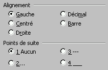
| Rule 1.5.4.3: Radio-buttons are aligned
vertically (in one or several columns) or horizontally on 1 line only. |
Example:
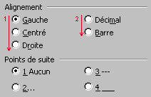
| Rule 1.5.4.4: The number of radio buttons
connected each other are 2 minimum. |
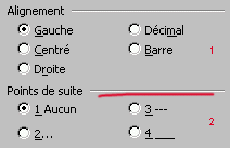
| Rule 1.5.4.5: Two different set of radio
buttons must appears in two different zones [Ex1] |
Example :
1.5.5.0 Lists
| Rule 1.5.5.0.1: The list are used only in
one of these cases:
|
| Rule 1.5.5.0.2: A list contains one and
only one choice by line. |
| Rule 1.5.5.0.3: Every list is described by
a label. It appears, preferably, over the list, otherwise at the left of
the list. |
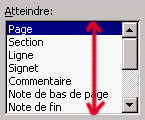
Rule 1.5.5.0.4: In a dialog box, the
height of a list is between 4 and 20 lines.
|
Rule 1.5.5.0.5: In order to propose a
choice between 0 and one element in a list: this list must:
- be a single selection list [1]
- start with the line/choice "(None)".
|
Remark
[1] The list can be a pulldown list
Example
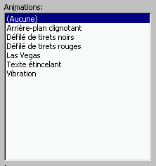
| Rule 1.5.5.0.6: In a list, column heading
control can be used for sorting the list, ascending or descending order. |
1.5.5.1 Single Selection Lists
Rule 1.5.5.1.1: A list zone with single
selection is composed of:
- a label
- a zone in which one and only one line is selected.
|
Remark: There is always a line selected when the list
appears
Example
Ex.1: Example of list zone with single selection (1 selection among n)
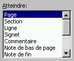
Ex.2: Example of list zone with single selection allowing 0 or 1 selection
among n.

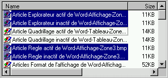
1.5.5.2 Extended Selection Lists
Rule 1.5.5.2.1: A list zone with extended
selection is composed of:
- a label
- a zone in which 0 or several lines can be selected at the same time.
|
| Rule 1.5.5.2.2: The definition of a
range is done by selection of the first boundary and Shift
+selection of the second. |
| Rule 1.5.5.2.3: The addition or
subtraction of an element in the list is done with Control+selection.
A addition or subtraction of a range is done by Control+selection
then Shift +Control+selection. |
Example
Ex.1: Example of list zone with extended selection
1.5.5.3 Modifiable Lists
Rule 1.5.5.3.1: A modifiable list zone is
composed of:
- a label
- a text field
- a zone containing all elements
- a command button to add an element
- a command button to modify an element
- a command button to destroy the selected element
- eventually a button to find
|
Remarks
Textfields can exist to ease the creation or the modification of elements in
a mono-column list only. (In case of multi-column, one textfield is not
sufficient). The textfield contains the selected element of the list.
The command buttons applies to the content of the textfield (so indirectly to
the selected element of the list.)
The buttons are necessary to know that the list is modifiable.
Examples
Ex 1: Modifiable list without textfield

the buttons Add... and Modify... have suspension points because a dialog
box appears to input both the Name and the Value fields.
Ex 2: Modifiable list with textfield
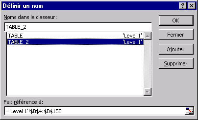
The button modify does not exist because the user can directly edit in the
textfield.
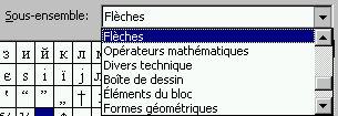
1.5.5.4 Pull Down Lists
Rule 1.5.5.4.1: A pull-down list is
composed of:
- a label
- a text field not editable
- an arrow button to display the list
|
| Rule 1.5.5.4.2: A pull-down list is a list
with single selection |
Examples
Ex.1: Example of pull-down list
Closed:

Opened:
1.5.5.5 Multiple Selection Lists
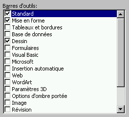
Rule 1.5.5.5.1: A list zone with multiple
selection is composed of:
- a label
- a zone in which 0 or several lines can be selected at the same time.
|
| Rule 1.5.5.5.2: The definition of a
range is done by selection of the first boundary and Shift
+selection of the second. |
| Rule 1.5.5.5.3: The addition or
subtraction of an element in the list is done by selecting
directly the element. |
Example:
Ex.1: Example of list zone with multiple selection
1.5.6 Textfields
| Rule 1.5.6.1: In a dialog box, every
textfield has a label at its left or over it. |
Examples
Over it:

On the left:

| Rule 1.5.6.2: The length of the textfield
is proportional with the length of text or the number to input and display |
Example
| Not to do |
To do |

A size of 999999999999 is improbable !!! |
 |
1.5.7 Counters
Rule 1.5.7.1: A counter is composed by a
label, an editable numeric field and two arrows.
 |
| Rule 1.5.7.2: The up (down) arrow increase
(decrease) the counter value to arise the next increment [Ex 1] |
Example
Ex 1: Example of behavior of arrows.
| Not to do: |
To do |
if
Value=0.12456 increment=0.1
then:
Up arrow => 0.22456
Down arrow => 0.02456 |
if
Value=0.12456
increment=0.1
alors:
Up arrow => 0.2
Down arrow => 0.1 |
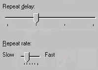
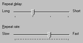
1.5.8 Sliders
Rule 1.5.8.1: A slider is made up with:
- a label defining the parameter represented
- two labels indicating the bounds of the range
- a cursor indicating the current value
|
Examples
| Not to do: |
To do |
|
|
|
1.6 Secondary Windows
Most primary windows (such as document windows) require a set of secondary
windows to support and supplement a user's activities in the primary windows.
Secondary windows obtain or display supplemental information during commands
dialog.
1.6.0 Characteristics of Secondary Windows
| Rule 1.6.0.1: Only one secondary window
appears at a time. |
Example
| Correct |
Incorrect |
| Only one
dialog box grouping all controls. |
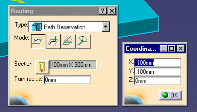
Two dialog boxes are defined simultaneously at the start of the
command. |
1.6.1 Dialog Boxes
1.6.1.1 Dialog Boxes Zones
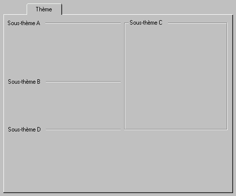
| Rule 1.6.1.1.1: All zones of a dialog box
must have a title and a separator except the first zone that can not have
one. |
| Rule 1.6.1.1.2: Two adjacent zones are
separated by a single separator (horizontal or vertical line) or by a
frame line. [1] |
[1] In other terms:
- Avoid omitting separator between two zones.
- Avoid displaying a double line between two zones (with two adjacent frames
for example)
- Avoid texts like "--------" as separators !
| Rule 1.6.1.1.3: The only zones surrounded
with a frame are previews and figures. |
| Rule 1.6.1.1.4: The first zone can omit
the horizontal line |
Example
Ex 1: tab page of a dialog box where composed of 4 zones whose titles are
names "Sous-thème X"
1.6.1.2 Dialog Boxes Layout
Rule 1.6.1.2.1: Articles inside a zone are
indented (of 1 character).
|
Not
to do |
To do |
|

|

|
|
|
Recommendation: The order of display and input of
controls must correspond to the logical order of work:
- Most important controls are displayed first (in terms of reading),
i.e. in the top left corner.
- The final validation or cancel is displayed last., i.e. at the
bottom right of the dialog box.
- Between these two ends, the separation in zones (with horizontal or
vertical separators) and the alignment of controls drive the way of
reading.
|
| Rule 1.6.1.2.2: A dialog box is resizable
only if it contains at least an array. |
| Rule 1.6.1.2.3: The size and the position
of the dialog box is kept from one use to the other during the session. |
| Recommendation: It is possible to have these data
persistent from a session to another but it is not compulsory. |
1.6.1.3 Command Buttons Zone
Rule 1.6.1.3.1: The command buttons of a
dialog box are:
- OK: applies all modifications done in the dialog
box since its apparition and then closes the dialog box.
- Cancel: interrupts the command, undoes all
modifications done in the dialog box since its apparition and closes
the dialog box.
- Preview: applies all modifications done in the
dialog box since its apparition or since the previous preview. The
dialog box stays on screen. The button is activable (not grayed) when
the representation of the document does not fit the values in the
dialog box.
- Close: close the dialog box and keep all
modifications of the document.
- Apply: uses all parameters of the dialog box to
perform the action and leaves the dialog box open. (Note that two
successive "Apply" do not give the same result than one).
|
Rule 1.6.1.3.2: The only possible
combinations of command buttons are:
- OK + Cancel
- OK + Cancel + Preview
- OK + Apply + Close
- Close
|
1.6.1.4 Dialog Box Default Button
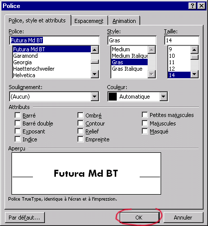
| Rule 1.6.1.4.1: The default button,
located in the command button zone of a dialog box, is framed by 1 pixel
black line. [Ex1] |
| Rule 1.6.1.4.2: The shortcut of the
default button is the Enter key. |
Example
1.6.1.5 Contextual Help
| Rule 1.6.1.5.1: Every control of a
toolbar, a menu bar or a dialog box has a contextual help window. |
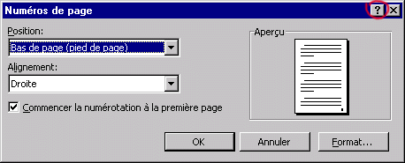
| Rule 1.6.1.5.2: The access to the
contextual help of items of a dialog box is through the button
"?" located at the right of the title bar of the dialog box
[Ex1]. For the other items (menu bar, menus, toolbars), the access is done
by the "What's this" in the help menu or the corresponding
button in a toolbar. |
Example
Ex1
| Rule 1.6.1.5.3: In a dialog box, the
contextual help is accessed by selecting equally well the item or its
label. |
Rule 1.6.1.5.4: In
a contextual help window of a command button, the text is
structured in the following parts and must contains:
| Order |
contextual help
window sentences |
for a command icon
in a toolbar |
fo ra command
button in a dialog box |
Example |
| 1 |
The name
of the item |
YES |
NO |
[Ex.1][Ex.2][Ex.3] |
| followed by
its localization put between parenthesis |
optional |
NO |
[Ex.1][Ex.2] |
| 2 |
The definition.
It usually begins by an acting verb conjugated with the present
tense, 3rd person of singular. |
YES |
YES |
"Do this" [Ex.1][Ex.2][Ex.3]
"Do this or do that" [Ex.4] |
| 3 |
The application
field of the control. (usually in a aside style) |
optional |
optional |
[Ex.4] |
| 4 |
The methodology
of use. (a "How to" information) |
strongly recommended |
strongly recommended |
"To do this, do that
way "[Ex.3]
"Use this to do that or to do that also"
"If you are in this state, do this to arrives at that"
[Ex.2] |
|
Examples
Ex.1
: The following example contains:
- name of article ("Aperçu avant impression") + localization
("(menu Fichier)")
- definition ("Affiche un aperçu...")

Ex.2: The following example contains:
- name of article + localization
- definition
- methodology ("Si la sélection est déjà...")
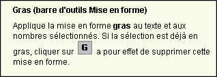
Ex.3: The following example contains:
- name of article
- definition
- methodology ("Pour obtenir...")

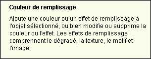
Ex.4: The following example contains:
- name of article
- definition
- Application field (note the style is like an aside: "Les effets de
remplissage...")
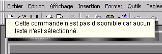
Ex.5: Examples on a Non accessible controls

1.6.1.6 Dialog box contents
Rule 1.6.1.6.1: If the selection field
corresponding to the object on witch the action is applied is displayed in
a dialog box:
- the selection field must be displayed first in the dialog box
- the focus must be on it if it is not already filled[1].
|
|
[1] The reason of having the focus on the object field is that the two
following sequences of interactions should work (in the simplest case):
select object + select action + OK
select action + select object + OK.
|
1.6.2 Message Boxes
Rule 1.6.2.1: There is 4 types of message
boxes:
- Information message box (at the end of a command dialog):
Gives information of the result of a command. Does not propose choices
to use. The only button is OK. [Ex1]
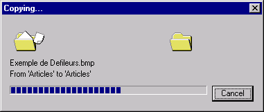
- Status message box (during the command): Indicates the
process of the command. Disappears automatically when the task ends.
It contains:
- A progress bar
- A cancel or a stop button
- Warning message box.: Warns about a situation or a condition
requiring a decision for the user It contains:
- A sentence (optional) that make a noticing of facts by
indicating the state in witch the system is. [1]
- A real question (with question mark)
- Buttons "Yes" and "No" that propose to
continue or to stop.
- Eventually a button "Cancel" to cancel the command.
[Ex2]
- Critical message box. Informs that a serious event occurs
that stops interrupt the command. This requires an intervention or a
correction to continue [Ex.3] or announces that the operation is not
possible [Ex4]
|
Examples
Ex 1: Example of Information message box

Ex 2: Example of Status message box
Ex 3: Example of Warning message box
| Correct |
Incorrect |
 "Yes"
and "No" buttons to answer the question "Yes"
and "No" buttons to answer the question |
 |
Ex:4: Example of Critical message box (with possibility to continue)

Note that the message says in an implicit way that the cause of the problem
may be the absence of a disk. ("Vérifiez..."). But the turn of phrase
leave the possibility of another error. Messages like "A disk is
missing". is prohibited.
Ex 5: Example of Critical message box (without possibility to continue)

Avoid to put message like "Your selection is wrong" (even if it is
true in this case): the message mustn't criticize the user.
Avoid also to but the message because the problem can occurs because of
another reason. The error can be elsewhere, for example, the user click the
wrong command (as simple as that !)
1.6.3 Components
1.6.3.3 Component Buttons
Rule 1.6.3.3.1: "Properties"
component buttons combinations are:
- Edit
- OK + Cancel
|
Rule 1.6.3.3.2: "Create
Form", "Insert Form / New", "Insert Form /
Existing" components buttons combinations are:
- OK + Add + Cancel
|
Rule 1.6.3.3.3: "Search"
component buttons combinations are:
- OK + Cancel
|
1.7 Tree
The tree is a specific view of a document that represent a hierarchy of links
between all objects included in the document.
1.7.1 Tree Presence
| Rule 1.7.1.1: If a hierarchical
information is always displayed, it must be represented as a tree. |
1.7.2 Tree Position
Rule 1.7.2.2: In P1 style, the tree is
displayed in the separated zone, at the left of the document zone inside
the document window
In P2 style, the tree is immersed in the left side of the unique graphical
zone of the document window. |
1.7.3 Tree Nodes
| Rule 1.7.3.1: The collapse and the
expand are strictly opposite actions. |
Rule 1.7.3.2: The collapsed-or-expanded
state is not document data, nor dialog data but view data:
- A collapse or an expand does not alter the current document.
- A collapse or an expand does not change the current command
dialog.
- The current command dialog cannot changes the expansion of the
tree.
- The document modification cannot changes the expansion of the
tree.
|
Rule 1.7.3.3: Nodes representing the
same object in different locations of the tree (or in different trees)
have independent behavior.
- Collapsing a node will not collapse the others
- Some feature can be a branch and somewhere else in the tree, the
same feature can be a terminal node. (It depends on the hierarchical
behavior is needed to display.
|
Rule 1.7.3.4: The states
collapsed/expanded of nodes are kept inside sessions and between
sessions.
- States is saved during the save of the document.
- If several document window are displayed, the active one is taken.
- Trees displayed in secondary views are not saved.
- Document nodes are restored collapsed.
|
1.8 Default Values and Customization
The user is the center of the user interface design. By initializing
appropriate default values, the software will better fit the context of the user
task.
Because of their widely varying skills and preferences, user must be able to
customize aspects of the interface.The software must provide user access to many
of these aspects. Your software should refect user settings.
1.8.1 Options Definition
| Rule 1.8.1.1: A General option
(items included in Tabs of general category of Tools/Options) is applied
in every workshop where it has a significance. (But it is not mandatory
that an option has a significance in all workshops) |
Remark
An option of Tools/Options is a parameter that should not be changed
often by the user.
Example
The mode of maximization of the document windows are not displayed in
Tools/Options but is directly on the window title bar. This parameter is
consistent (kept through time).
1.8.2 Options Tab Pages
| Rule 1.8.2.1: Tab Pages of options are
classified by categories. The list of categories begins by General
followed by the list of workshops classified in alphabetical order. |
| Rule 1.8.2.2: A tab page of options must
be filled more than the half. [1] |
Remark
[1] Tab-pages with just a few controls are forbidden because it increase
tremendously the number of tab-pages and decrease the probability to find the
option. (Consider the frustration of user who tries to find an option.)
1.9 Manipulator Robot
1.9.1 Presence
| Rule 1.9.1.1: If the document window is
basically a 3D window, the manipulator robot is present at the top right
corner of the window

|
1.9.2 Unicity
| Rule 1.9.1.2: There is one and only one
graphical representation of the manipulator robot when located at its home
position.

There is one and only one graphical representation of the manipulator
robot when used for drag and dropping.

|
1.10 Power Input
1.10.1 Power Input and Dialog Boxes
| Rule 1.10.1.1: If a command has a dialog
box, and is part of a P2 product, the commands supports the power input |
| Rule 1.10.1.2: The command does not change
the "Power Input" visibility status of dialog boxes [1]. |
[1] Only the user can hide or show dialog boxes with the following button:

[Top]
History
| Version: 1 [Jan 2000] |
Document created |
| [Top] |
Copyright © 2000, Dassault Systèmes. All rights reserved.


 and
and 


 Only
one column on authorized sides.

 (b)
(b)


 "Yes"
and "No" buttons to answer the question