Rules and Standards |
CAA V5 Ergonomics Rules - Part 4Visual Design |
|
| Technical Article | ||
4.1 Design of Visual Elements
4.2 User Interface Text
4.3 Design of Graphic Images
| Win | Web |
| Rule 4.1.1.1: If a control or an item is not available (because the command or the data associated is not available), it must be displayed with an unavailable appearance (grayed). |
| Web |
| Rule 4.1.1.2: Unavailable state for a
button is like this: |
| Web |
| Rule 4.1.1.3: Normal state for a button is
like this: |
| Web |
| Rule 4.1.1.4: Default button state is like
this: |
| Web |
| Rule 4.1.1.5: Pressed state for a
button is like this: |
| Web |
| Rule 4.1.1.6: Main buttons are center
aligned in the bottom of the component
Example: |
| Web |
| Rule 4.1.1.7: For main buttons, there is a horizontal
line like this:
|
| Web |
| Rule 4.1.1.8: Additional buttons are left
aligned within a component zone
Example: |
| Web |
| Rule 4.1.2.1: For each component, there is
a title within a banner |
| Web |
| Rule 4.1.2.2: Tabs look like this: |
| Web |
| Rule 4.1.2.3: There is no rectangular border all around a component. |
| Web |
| Rule 4.1.2.4: These lines are used
to visualize frontiers between two components or two zones within a
component : |
| Web |
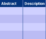
Rule 4.1.2.5: A table header has
specific background color like this: |
| Web |
Rule 4.1.2.6: In a table, row color
changes every two rows like this: |
| Web |
Rule 4.1.2.7: In a table, every column
has a border vertical line on right side. There is no border all around a
cell. |
| Web |
| Rule 4.1.2.8: If sorting is
available for a table, there is this visual indicator.
Sort is available: |
| Web |
| Rule 4.1.2.9: If the warning icon is
used, it is located on the right side of the item like this: |
| Web |
| Rule 4.1.2.10: If a component zone has a sub-title,
it is like this:
Example: zone sub-title "1-Domain" |
| Web |
| Win | Web |
| Rule 4.2.1.1: For each object, use only one term, to maintain the interface consistency |
| Correct | Incorrect |
| Save | Commit |
| Configurable View | CO or CV |
| Search | Query |
| Win | Web |
| Rule 4.2.1.2: Use a common vocabulary, generic and easy to understand. Do not use any computer vocabulary. |
| Win | Web |
| Rule 4.2.1.3: Translate all the object names and commands into professional vocabulary known by the end-user. |
| Correct | Incorrect |
| Planes Products Plane Version |
Product Root Class |
| Product | PRC |
| Product Container | CATProd Cont |
| Win | Web |
Rule 4.2.1.4: Texts in labels respects the rules of vocabulary
and grammar of title of books.
|
| Win | Web |
| Rule 4.2.1.5: There is no abbreviation in labels. |
| Correct | Incorrect |
| Action | IDX_Action |
| Item | VPM_Item |
| Win | Web |
| Rule 4.2.1.6: The only authorized characters are letters and space and "..." [1]. |
[1] In a menu, "..." indicates that the command will not terminate immediately. The users expect a continuation in the dialog sequence (for example a dialog box)
| Win | Web |
| Rule 4.2.1.7: Avoid redundances in dialog boxes titles. |
| Correct | Incorrect |
| The title describes
the content of the dialog box. This dialog box can appears both during the creation or the edition. |
Once selected the "Area" command for the creation, the word creation is redondant. |
| Win | Web |
| Rule 4.2.1.8: The dialog box title is the name of the related command (or slight modification). |
| Correct | Incorrect |
  Name
of the command of creation of a product and its dialox box are consistent. Name
of the command of creation of a product and its dialox box are consistent. |
  Title of the dialog box has no relation with the command. |
| Web |
| Rule 4.2.2.1: Default text uses default font, regular style and normal size. Do not use bold style. |
| Web |
| Rule 4.2.2.2: Selected text is white highligted
over red background.
Example: |
| Web |
| Rule 4.2.2.3: Title banner is
larger font size, and bold style. Do not use italic style.
Example: |
| Web |
| Rule 4.2.2.4: A table header text is
bold style and white color.
Example: |
| Win | Web |
Rule 4.3.1.1: The sizes of the icons are:
|
In all icons cases, the transparency is defined by the upper left pixel. All pixel that has the same color will be considered as transparent.
| Icon state | Normal size | Small size |
| Unpressed | ||
| Focused | ||
| Pressed |
| Win | Web |
| Rule 4.3.1.2: An icon has a single meaning. (If two similar command icons are identical, they perform the same action) |
| Correct | Incorrect |
| Different icons for "Standard
Print" and "Captured Image Print" (for Save and Copy too)
or Use the same command (for Save and Copy too). |
Same Save Print icon for Document Save and Capture Save Same Icon Print icon for Document Print and Capture Print Same Icon Copy icon for Selection Copy and Capture Copy |
[Top]
| Version: 1 [Jan 2000] | Document created |
| [Top] | |
Copyright © 2000, Dassault Systèmes. All rights reserved.